Author: saritawavhal

Real world Data Analysis using Healthcare Data
I want to share the details of my personal data analysis project, where I delved into real-world healthcare sample data provided by Curtis Norman. The project took me through the process of transforming raw data into meaningful insights, and I’m excited to walk you through the steps of my exploration.
The Data:
The sample dataset is provided in the format of an Excel worksheet. The data, a snapshot of real-world healthcare information, was the starting point for my analytical journey. Understanding the nuances of healthcare data is a challenge, but it’s also an opportunity to make a meaningful impact.

Creating the Database:
To unlock the full potential of the data, I decided to use Microsoft SQL Server. I began by creating a relational database, a structured foundation that would facilitate seamless data management and analysis. The process involved defining tables, establishing relationships, and ensuring data integrity, laying the groundwork for an analytical framework.
Importing Data and Building the Data Model:
The next step was to import the healthcare data from the Excel worksheet into the SQL Server database. This process is crucial for transforming raw data into a format conducive to analysis. Once the data was securely housed in the database, I set about constructing a comprehensive data model. This involved organizing and structuring the data in a way that would enable efficient querying and analysis.

Writing Multiple Views:
To enhance the flexibility of my analysis, I crafted multiple views within the SQL Server database. Views act as virtual tables, presenting data in a way that aligns with specific analytical needs. This step allowed me to tailor my approach, ensuring that I could explore different facets of the healthcare data with ease.
Connecting SQL Server Database to Power BI:
The true magic happened when I connected the SQL Server database to Power BI, a dynamic business analytics tool. This integration opened up a world of possibilities, enabling me to visually represent the data and create insightful reports. Power BI’s user-friendly interface and powerful features allowed me to translate complex data into meaningful visuals.
Building Multiple Page Reports:
With the SQL Server database seamlessly integrated into Power BI, I set about constructing a multi-page report. Each page focused on a specific aspect of the healthcare data, providing a holistic view of the information. From demographic trends to Payer Analysis, the report became a narrative, weaving together the story hidden within the numbers.
Getting started with Power BI: A beginner’s guide for data enthusiasts

Image by CosmoStudio on Freepik
If you’re interested in learning about Power BI and how to get started with this powerful data visualization tool, then this post is for you. As someone who has been using Power BI for a while now, I wanted to share some tips and insights with those who are just starting out.
First of all, let me tell you that Power BI can seem overwhelming at first. But don’t worry; you’re not alone. There are so many features and options to choose from, and it can be hard to know where to begin. However, with a little bit of guidance, you’ll be able to create stunning visualizations and become a Power BI pro in no time.
Download and install Power BI Desktop
To start off, you’ll need to download Power BI Desktop. This free tool allows you to create, view, and share interactive reports and dashboards. You can download Power BI Desktop from the official Microsoft website.
Connect to tour data sources
Once you have Power BI Desktop installed, the next step is to connect to your data sources. Power BI supports a wide range of data sources. To connect to your data, click on the “Get Data” button in the Home tab of the Power BI Desktop. From there, you can choose from a variety of data sources and connection types. For example, if you want to import data from an Excel spreadsheet, you can select the “Excel” option and then navigate to the file on your computer. If you want to connect to a database, you can select the appropriate database type (such as SQL Server or Oracle) and then enter your server and login credentials. Once you’ve connected to your data source, you’ll see a preview of the data and can begin exploring and manipulating it.
Transform and clean your data
Now it’s time to transform and clean your data. Power BI offers a powerful data transformation and cleaning tool called Power Query, which allows you to perform a variety of data transformation tasks without leaving the application. With Power Query, you can easily clean up messy data, remove duplicates, split and merge columns, and perform calculations and other transformations. You can also use Power Query to reshape your data by pivoting, unpivoting, and grouping it in different ways.
To use Power Query, simply click on the “Transform Data” button in the Home tab of the Power BI Desktop. This will bring up the Power Query Editor, where you can perform a variety of data transformation tasks using an intuitive, drag-and-drop interface. By transforming and cleaning your data in Power Query, you can ensure that your data is accurate, consistent, and ready for analysis. This will save you time and effort down the line and help you get more value out of your data. Plus, by cleaning your data within Power BI, you can easily refresh your reports and visualizations with updated data as it becomes available.
Understand relational data modeling
But before you dive into creating visualizations in Power BI, it’s important to understand the relational data model. The relational data model is a method of organizing data into tables and establishing relationships between those tables. This allows you to easily analyze and manipulate the data to gain insights. To understand the relational data model, it’s important to know the different types of relationships that can exist between tables. These include one-to-one, one-to-many, and many-to-many relationships. In a one-to-one relationship, each record in one table is associated with only one record in another table. In a one-to-many relationship, each record in one table can be associated with multiple records in another table. In a many-to-many relationship, multiple records in one table can be associated with multiple records in another table.
DAX measures and calculated columns
DAX (Data Analysis Expressions) is a formula language used in Power BI to create custom calculations and measures. Measures are calculations based on the values in a column or columns in your data model, while calculated columns are new columns that you create based on a formula that you define. These DAX expressions can be used in visualizations to create more advanced analysis and insights. Measures are typically used for aggregations, such as summing up sales or calculating averages. Calculated columns, on the other hand, are used for more complex calculations that can’t be done using measures alone. For example, you might use a calculated column to create a new column that categorizes data based on a specific criteria, or to calculate the difference between two columns.
When creating DAX expressions, it’s important to understand the syntax and logic behind the language. Fortunately, Power BI offers a number of built-in functions that can be used to create more complex calculations without having to write custom code from scratch. Additionally, there are many resources available online, including tutorials and community forums, where you can learn more about DAX and get help with specific challenges. By learning how to use DAX measures and calculated columns in Power BI, you’ll be able to create more sophisticated analyses and visualizations that provide deeper insights into your data.
Create visuals
Once you have a good grasp of the data model and how to create calculated columns and measures, you can start building your visualizations. The best way to do this is to start with a clear goal in mind. What do you want to communicate with your data? Is there a particular insight you’re trying to uncover?
Once you know what you’re trying to achieve, you can select the appropriate visualization type and start customizing it to your liking. One of the great things about Power BI is that it offers a wide variety of visualization types to choose from. You can create simple bar charts, line graphs, or pie charts, or you can get more creative with heat maps, tree maps, and other custom visuals. You can drag and drop fields from your data sources onto the canvas to create your visualizations. Also, it’s very easy to switch between different visualizations and see how your data looks in each one. This allows you to experiment and find the best way to communicate your insights.
Customize your visualizations
Once you’ve created your visualizations, you can customize them to your liking. Power BI offers a range of formatting options, including colors, fonts, and backgrounds. You can also add interactive features like drill-downs and filters to make your visualizations more engaging. You can also add additional visualizations to your report and arrange them in different layouts to create a more cohesive and engaging story. For example, you can use a combination of charts and graphs to illustrate trends over time, highlight comparisons between different data sets, or showcase geographical patterns.
To customize your visualizations in Power BI, simply click on the visualization you want to edit, and then use the formatting and customization options in the Visualizations pane to make your changes. With a little bit of experimentation and practice, you can create visualizations that are both informative and visually appealing, helping you better communicate your data insights to your audience.
Share your reports and dashboards
The final step is to share your reports and dashboards with others. Whether you’re collaborating with colleagues or sharing your data insights with stakeholders, Power BI provides a range of options for sharing your content by publishing it to a Power BI workspace or app. You can also control the level of access they should have. For example, you can share a report with a colleague and give them view-only access, or you can share a dashboard with a stakeholder and give them the ability to edit and analyze the data. Additionally, you can share your content via email or embed it on a website or application.
By sharing your reports and dashboards in Power BI, you can ensure that everyone who needs to see your data insights has access to them, regardless of their location or device. This can help increase collaboration and drive better decision-making across your organization.
In conclusion, I want to assure you that starting your Power BI journey might seem overwhelming at first, but trust me, it’s worth it. With the right guidance, you can quickly master the art of creating visually stunning reports and dashboards that will impress your colleagues and clients alike. Just follow the steps I’ve outlined, and you’ll be amazed at what you can achieve. And don’t forget, practice makes perfect! The more you work with Power BI, the more confident and innovative you’ll become in creating beautiful and effective data visualizations. So go ahead and give it a try; I promise you won’t regret it!
How to think like an analyst?

Image by peoplecreations on Freepik
Have you ever wondered what sets analysts apart from other professionals? They have a unique approach to problem-solving and decision-making. They can make sense of even the most complicated data and provide insights that are extremely valuable. But how can you develop the mindset and skills necessary to think like an analyst?
Here are some tips to help you embrace the analyst’s mindset and the skills necessary to excel in this exciting field.
Understand the business problem
To be an effective analyst, you need to understand the business problem you are trying to solve. This involves understanding the business goals, the stakeholders involved, and the data that is available. By understanding the problem, you can focus your analysis on the key questions that need to be answered.
Define the problem in a clear and concise way
Once you understand the business problem, you need to define it in a clear and concise way. This involves identifying the key questions you need to answer, the data you need to analyze, and the metrics you will use to measure success. By defining the problem in this way, you can ensure that your analysis is focused and targeted.
Gather and analyze data
Once you have defined the problem, you need to gather and analyze data to answer the questions you have identified. This involves using data analysis techniques such as statistical analysis, data visualization, and data mining to identify patterns and insights in the data. By analyzing the data, you can uncover insights that will help you make informed decisions.
Communicate your findings
Once you have analyzed the data, you need to communicate your findings to stakeholders in a clear and concise way. This involves creating reports and visualizations that highlight the key insights you have uncovered and make recommendations based on your analysis. By communicating your findings in this way, you can ensure that your analysis is actionable and useful.
Continuously improve
Finally, to think like an analyst, you need to continuously improve your skills and techniques. This involves staying up-to-date with the latest data analysis tools and techniques, as well as learning from your successes and failures. By continuously improving, you can become an even more effective analyst and make even better data-driven decisions.
In conclusion, to think like an analyst, you need to understand the business problem, define the problem in a clear and concise way, gather and analyze data, communicate your findings, and continuously improve. With practice and dedication, you can become an effective analyst who is able to use data to drive business success.
Jumpstart your career: Tips for becoming a business intelligence analyst

Are you interested in becoming a business intelligence analyst? With the demand for data-driven insights on the rise, this field is a great choice for those looking for a challenging and rewarding career. Here are a few tips to help you get started:
Develop your technical skills
To succeed as a business intelligence analyst, you need to have a solid foundation in data analysis and visualization tools. Familiarize yourself with SQL, Excel, and Power BI or Tableau, and consider taking courses or earning certifications in these areas.
Build your business acumen
To be effective in this role, you need to have a deep understanding of the industry you’re working in. Take the time to learn about the products, services, and customers of the company you’re interested in, and read up on industry trends and best practices.
Network with others in the industry
Attend conferences, join professional associations, and connect with other business intelligence analysts on LinkedIn. These connections can provide valuable insights into the industry and help you stay up-to-date on the latest trends and technologies.
Look for opportunities to gain experience
Look for internships or entry-level positions in business intelligence. Even if you start in a junior role, the experience you gain will be invaluable in developing your skills and building your career.
Highlight your achievements
When applying for jobs, make sure to highlight your achievements in data analysis and visualization. Share examples of how you’ve used data to solve business problems and drive decision-making. Try to use industry keywords in your resume.
Starting a career in business intelligence can be challenging, but with the right skills and mindset, you can succeed in this exciting field. So take the first step today and start developing the skills and connections you need to launch your career as a business intelligence analyst.
Tips and strategies for taking your analytical thinking skills to the next level

Image by vector4stock on Freepik
The ability to analyze and comprehend data has become an increasingly vital skill in a world where practically every organization relies significantly on it. Business analysts play an important role in assisting businesses in making informed decisions by finding patterns and trends in data and providing insights and recommendations. However, to be an effective business analyst, you must cultivate a mindset that is focused on data-driven decision-making and analysis.
So, here are some tips for developing analytical thinking skills.
Develop a curious mindset
One of the most important qualities of an effective analyst is curiosity. Curiosity drives an analyst to ask questions, explore new ideas, and discover new insights. To develop a curious mindset, ask questions, read books and articles outside of your comfort zone, and look for opportunities to learn new things.
Practice critical thinking
Critical thinking is the ability to analyze information objectively and make evidence-based decisions. To develop critical thinking skills, evaluate information from multiple sources, question assumptions, and test hypotheses.
Improve your problem-solving skills
Analytical thinking involves breaking down complex problems into smaller, more manageable components. To improve your problem-solving skills, practice breaking down problems into smaller pieces and solving them step-by-step.
Learn to communicate effectively
Effective communication is essential for an analyst to convey complex information in a clear and simple manner. Practice writing and presenting your findings to different audiences to develop your communication skills.
Develop your technical skills
Technical skills are essential for an analyst, and developing them is crucial for success. Learn to use analytical tools and software such as Excel, SQL, Power BI, or Tableau and stay up-to-date with the latest trends in the field.
Analytical thinking skills are essential for success in the field of business analysis. Developing a curious mindset, practicing critical thinking, honing your problem-solving skills, learning to communicate effectively, and developing your technical skills are all important strategies for unlocking the mind of an analyst. By following these tips, you can take your analytical thinking skills to the next level and become a valuable business analyst.

Designing mobile dashboards like a pro: Best practices for Power BI users
Image by rawpixel.com on Freepik
Data plays a critical role in making informed decisions in today’s rapidly changing world. With mobile devices becoming an inseparable aspect of our daily lives, we are increasingly dependent on them for conducting business-related tasks. As a result, it has become essential to create mobile dashboards that provide easy access to critical data on the go. Power BI mobile apps allow your end users to access any Power BI report page on their device. But reports designed for use on a computer can be difficult to read and interact with on mobile phones.
Therefore, I would like to share some of the best practices that I follow in Power BI to create professional-looking mobile dashboards.
Keep it simple
The first and most important rule of creating a mobile dashboard is to keep it simple. Mobile screens are smaller than computer screens, so it’s essential to focus on the most critical information. Avoid cluttering the dashboard with too many visuals, charts, and tables. Use only the necessary elements that convey the data story.
Plan your dashboard layout
Before you begin creating your dashboard, it’s important to plan out the basic layout. Think about what information you want to present and how you want to present it. You should also consider the target audience and what devices they are likely to use. With this in mind, you can design the dashboard to be mobile-friendly from the beginning.
Use a grid layout
A grid layout is an effective way to organize your dashboard. It helps to maintain a consistent look and feel throughout the dashboard.
Use mobile formatting options
In Power BI, use mobile formatting options to style and format visuals in a mobile-optimized layout without affecting their formatting in a web layout.
Optimize visualizations for mobile
Power BI offers a variety of visualizations; however, not all of them are responsive and suitable for mobile devices. Avoid using visualizations that are too complex or require too much interaction, as they can be difficult to use on a small screen.
Use drill-through navigation
Drill-through navigation allows users to click on a data point to see more detailed information. This feature is particularly useful on mobile devices, as it reduces the need for users to navigate through multiple pages to find what they need.
Test your dashboard
Before publishing your dashboard, test it on multiple devices to ensure that it is mobile-friendly. Make sure that the visuals are easy to read and interact with on a small screen and that the layout is optimized for mobile devices.
Publish your dashboard
Once you’re happy with your mobile-friendly dashboard, you can publish it to the Power BI service. Users can access the dashboard from any device with an internet connection, making it easy to stay up-to-date on the go.
In conclusion, creating a mobile-friendly dashboard in Power BI requires careful planning and consideration of the target audience and device. By following these practices, you can create a professional-looking dashboard that is easy to use and provides valuable insights on any device.

How can you showcase your SQL skills as a business intelligence analyst?
Image by Freepik
SQL (Structured Query Language) is the language of data, and it is the primary tool used in the business intelligence industry for working with data. If you want to succeed as a business intelligence analyst, you need to demonstrate your SQL skills.
Here are some ways to showcase your SQL skills:
Build a portfolio
Create a portfolio of projects that demonstrate your SQL skills. This could include data cleaning, data modeling, and data analysis projects. Make sure to explain your process and the insights you gained from each project.
Participate in SQL challenges
Participating in SQL challenges or competitions is another way to showcase your SQL skills. There are many online SQL challenges available, and participating in them can help you compare your skills with other analysts. This way you can demonstrate your proficiency in working with data and providing valuable insights.
Use Github
Upload your SQL projects to Github, which is a widely recognized platform for showcasing coding skills. This will allow potential employers or clients to view your code and see how you have structured your queries.
Participate in online communities
Participating in online communities such as Stack Overflow and GitHub can help you showcase your SQL skills by answering questions related to SQL and posting your own solutions to problems.
Take online courses and earn certifications
Taking online courses and earning certifications in SQL can demonstrate your dedication to improving your skills and staying current with the latest trends in the field.
Use data visualization tools
Use SQL to extract insights and then present them using data visualization tools such as Tableau, PowerBI, or Excel. This will demonstrate your ability to not only extract insights from data but also present them in a visually appealing and meaningful way.
By using these methods, you can differentiate yourself from other analysts and advance your career in the business intelligence field.

Mastering data visualization: 5 essential color selection best practices
Photo by David Pisnoy on Unsplash
As a business intelligence analyst, one of the most critical aspects of your job is communicating data insights effectively. To do that, you need to make sure that the data visualizations you create are not only accurate but also engaging and easy to understand. And one of the key factors that can make or break a visualization is the colour scheme.
Colour selection for data visualization is not just about making things look pretty. It’s about making sure that the message you want to convey is clear and easy to understand.
Following are some best practices for colour selection for data visualization.
1. Consider the audience
The first thing you need to consider when choosing colours for your data visualization dashboard is your audience. Who will be looking at your dashboard? What are their preferences? What do they expect to see? For example, if you’re designing a dashboard for a business audience, you may want to use more conservative colours like blues and grays.
2. Use colour to highlight important data points
One of the main goals of data visualization is to draw attention to the most important data points. You can use colour to help you do that. For example, you might use a different colour to highlight a data point that is outside of a normal range or that represents a significant change.
3. Be consistent
Consistency is key when it comes to colour selection for data visualization. You want to make sure that the colours you use are consistent across your dashboard. This not only makes it easier for your audience to understand the information but also makes your dashboard look more professional.
4. Consider colorblindness
It’s important to consider colorblindness when choosing colours for your data visualization. It’s important to make sure that your colour scheme is still easily understandable to those with color vision deficiencies. You can do this by using colour schemes that have high contrast or by using patterns or textures in addition to colour.
5. Use colour sparingly
Colours should be used sparingly in data visualization. Using too many colours can make your dashboard look cluttered and confusing. Stick to a few key colours that work well together, and use them consistently throughout your dashboard.
In conclusion, colour selection for data visualization is a key aspect of developing successful and engaging data visuals.
- Consider your audience
- Use colour to emphasize important data points
- Be consistent
- Consider colour blindness
- Use colour wisely
to create data visualizations that are not only accurate but also visually appealing and easy to understand.
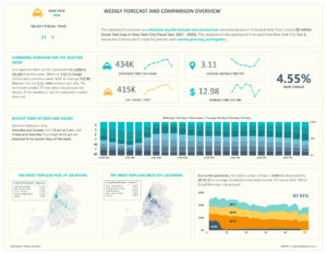
New York taxi weekly forecast & comparison overview
This week I analyzed a HUGE data set provided by Maven Analytics, which contained records of 28 million Green Taxi trips in New York City. It was perfect for data wrangling and visualization task. I picked up my favorite BI tool Power BI to complete this entire project.
Task
Build a dashboard to assist the Lead Dispatcher with weekly planning and logistics based on Green Taxi Trips in New York City (Year 2017-2020).
Answering the following questions:
- What’s the average number of trips we can expect this week?
- What’s the average fare per trip we expect to collect?
- What’s the average distance traveled per trip?
- How do we expect trip volume to change, relative to last week?
- Which days of the week and times of the day will be busiest?
- What will likely be the most popular pick-up and drop-off locations?
Dataset
Provided dataset contained records of 28 million Green Taxi trips in New York City for four fiscal years 2017 to 2020. The raw data has some issues, so it required the following adjustments and assumptions to clean and prepare the data for further analysis.
- Included trips that were NOT sent via “store and forward”
- Included street-hailed trips paid by card or cash, with a standard rate
- Removed any trips with dates before 2017 or after 2020, along with any trips with pickups or drop-offs into unknown zones
- Assumed any trips with no recorded passengers had 1 passenger
- Swapped dates If a pickup date/time is AFTER the drop-off date/time
- Removed trips lasting longer than a day, and any trips which show both a distance and a fare amount of 0
- Changed any records where the fare, taxes, and surcharges are ALL negative into positive value
- Calculated the distance for any trips that had a fare amount but a trip distance of 0, using this formula: (Fare amount – 2.5) / 2.5
- Calculated the fare for any trips that had a trip distance but a fare amount of 0, using this formula: 2.5 + (trip distance x 2.5)
Data Cleaning and Preparation task completed using Power Query

Final Dashboard
Check out an interactive report here: https://bit.ly/3Oj42S1