My Work

How do you deal with missing values while cleaning data?

Data sets often come with missing values. The problem of missing data is relatively common and can significantly affect the conclusions drawn from your data. There can be several reasons why some values are missing from the data. Investigating these missing values and how they are recorded in the data is essential for every analysis.

In many cases, we can not simply remove missing values, because we need enough data for meaningful analysis. Although there is no single accepted solution, It is often helpful to look at the context of the problem and dig deeper into causes and plan your solution for missing values. 

What are missing values?

The following values are considered missing values.

Null
NA
N/A
#N/A
NaN
“-”
“Invalid”
Blank

How to handle missing values?

We can use a number of strategies to handle missing data. However, these are the most common methods.

Remove

The first common method to deal with missing data is to delete the rows with missing values. However, it is not always possible to simply delete the data as this can lead to loss of information. Therefore, before removing data, It is important to confirm that there is no pattern or bias in the missing values. This method is not useful when the data set is too small.

Keep

Missing values may themselves can be informative. If a dataset is small, removing data can reduce statistical power. Therefore, try to keep as much data as possible if you are certain that they are accurate. If a value is missing because it doesn’t exist, there’s no point in guessing what it is, so you should leave the missing value as zero.

Impute

Imputing or guessing a value is one of the most common methods ​​when dealing with missing data because it wasn’t recorded. In some cases, we can fill in the missing values with zeros (0). However, filling missing values ​​with zeros is often not a good idea, as the original missing value may be something else. The zeros can cause misinterpretation of the data. Alternatively, we could use the mean or median of the existing observations, or a smart guess from some interpolation. We can use observations from similar data points to intelligently guess the value. In most cases, imputation methods can provide fairly reliable results, depending on why the data are missing.

Of course, there more options for dealing with missing values. It is important to understand and choose the right options because missing values ​​can have a huge impact on the final results.

What other methods do you recommend or use to process your data? Let me know in the comments section.

Exploratory Data Analysis of the Titanic Dataset

I have participated in the DataDNA October Challenge the Titanic Kaggle dataset. Analyzing the Titanic Kaggle dataset to identify which class was most likely to survive the Titanic disaster.

Dataset

Provided data is a themed dataset and may not be accurate against the actual events of the Titanic disaster. The titanic sample dataset records only 418 passengers’ data.

Task

Identify which class was most likely to survive.

My Process

In order to know how well each characteristic correlates with survival, I decided to approach the problem based on the characteristics available in the dataset.

Analyzed the given dataset for errors or possibly inaccurate values within characteristics and tried to correct those values or excluded the samples containing the errors.

Age data in this dataset is incomplete. It contains 86 null values which will not be included while measuring age correlation with survival rate. The cabin and ticket features are dropped during the analysis because of fewer data points.

Classifying available characteristics in the given dataset would facilitate further analysis.

Categorical:

Sex – Gender of passenger: male or female

Class – 1 = First Class, 2 = Second Class, 3 = Third Class

Point of embarkation – C = Cherbourg, Q = Queenstown, S = Southampton

Survived – 0 = Dead, 1 = Alive

Numerical:

Age – Age of passenger

Fare – Fare paid for a ticket

SblSp – Number of traveling with sibling or spouse

Parch – Number of traveling with parent or children

Findings

Passenger’s Gender

Out of 418 total passengers, only 152 (36%) survived and 266 (64%) died. This includes 100% of females who were rescued, compared to 100% of males who died. Most females (72) traveled in 3rd Class. This reflects that gender influences the number of survivors because women from all classes were rescued with priority over men.

Passenger’s Age

Children had the highest survival rate of 46% considering they were accompanied by their mothers. Young adults around the age of 20 to 30 had the lowest survival rate of 37%. Most of them traveled in the 3rd class.
Note – Age data in this dataset is incomplete. The age characteristic contains 86 null values, which are not included in the above chart.

Traveling with Siblings or Spouse

Passengers traveling with siblings or spouses had higher survival rates than those traveling alone.

Traveling with Parents or Children

Passengers who lost the most traveled alone in comparison to passengers with parents or children. Most of those families traveled in the 1st class while most solo passengers traveled in the 3rd class.

Port of Embarkation

(65%) passengers embarked from Southampton port, (24%) from Cherbourg port, and (11%) from Queenstown port. Passengers who boarded from Queenstown had the highest (52%) survival rate compared to Cherbourg (39%) and Southampton (33%).

Class of Travel

The survival rate was highest in the First class (47%), followed by the third class (33%) and second class (32%). This reflects the fact that the highest fare-paid passengers had the highest survival rate.

Summary

Overall, several characteristics were observed that correlated with the rate of survival of the Titanic Disaster.
Gender: Female passengers from all classes were rescued with priority.
Family: Passengers who traveled with family members had the highest survival rate. Most of them traveled in the 1st class and unaccompanied passengers who lost the most were in the 3rd class.
Age: Young adults around the age of 20 to 30 had the lowest survival rate since most of them traveled in the 3rd class.
Class:
1st class passengers were given priority as they paid the highest fare compared to other classes.
Embarkation:
Highest number of passengers who embarked from Southampton and traveled in 3rd class had the lowest rate of survival.

Data Visualization

Operational performance analysis to identify opportunities to improve productivity and increase revenue.

This is my submission for Maven Analytics’ Pizza Challenge October 2022. This report summarizes Plato’s Pizza restaurant’s annual performance of the year 2015. Additionally, it makes recommendations to identify opportunities to increase sales and perform more efficiently.


Data Set

Plato’s Pizza is a fictitious Greek-inspired pizza place in New Jersey. The dataset provided in the Data Playground contains one year of sales data. It contains four tables in CSV format.

Task

Create data models and use your data analysis & visualization skills to bring the data to life. Analyze data and create a report to help Plato’s Pizza find opportunities to drive more sales and work more efficiently.

Also, answer the following questions.

  1. What days and times do we tend to be busiest?
  2. How many pizzas are we making during peak periods?
  3. What are our best and worst selling pizzas?
  4. What’s our average order value?
  5. How well are we utilizing our seating capacity? (we have 15 tables and 60 seats)
My Process

Plato’s Pizza has already defined the goals of this analysis, so I mainly focused on answering all the questions using Power BI. Created some Dax measures and calculated columns.

Visualization is my favorite part. An important component of being a data analyst is the ability to communicate your findings in a way that will appeal to your audience. We are always tempted to show every metric possible. But more is not always good. Since too many elements can be distracting I decided to include graphs that answer Plato’s questions.

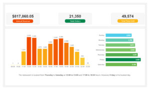
1. What days and times do we tend to be busiest?

2. How many pizzas are we making during peak periods?

3. What are our best and worst selling pizzas?

4. What’s our average order value?

Average Daily Revenue = 
AVERAGEX(
    VALUES(orders[date]),[Total Revenue]
)


Average Daily Orders = 
AVERAGEX(
    VALUES(orders[date]), [Total Orders]
)
Average Daily Pizzas Sold = 
AVERAGEX(
    VALUES(orders[date]), [Total Quantity Sold]
)
Average Pizzas Per Order = 
DIVIDE([Total Quantity Sold],[Total Orders]
)
Average Order Value = 
DIVIDE([Total Revenue], [Total Orders]
)


5. How well are we utilizing our seating capacity? (we have 15 tables and 60 seats)

Recommendations:
  • The most popular large size pizzas are generating highest (45.89%) revenue $375.32K whereas XXL size pizzas are generating least (0.12%) revenue $1.01K. Therefore, XXL size can be removed from the menu.
  • Changing restaurant opening time to 11:00 to 22:00 hours can reduce operational cost.
  • Replacing 50% seating arrangement with 2-seater tables will maximize utilization of seating capacity.
  • To drive more sale on Sunday and during post lunch off hours, Plato’s should run promotions / special offers.

Data Visualization

Check out an Interactive Version.

Professional end to end business intelligence solution using Microsoft Power BI

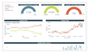
This is my personal project. Spirit Sport, is a fictional global manufacturing company. As a Business Intelligence Analyst, my task is to design and deliver professional and end to end business intelligence solution using Microsoft Power BI. The raw data is provided in CSV files. (Data Source: Maven Analytics).
I have followed a steady and systematic process through the Power BI workflow and divided this project into four steps.

Step 1: Connecting and transforming the raw data

I received the raw data in an unformatted structure. Therefore, after importing all CSV files into Power BI, I had to transform them into a suitable format and extract meaningful insights using the power query editor.

Step 2: Build a relational data model

In this project, the model consists of six lookup tables: Customer, Calendar, Territories, Product, Product Category, and Product Sub Category.

And two fact tables: Sales and Returns. I have used the snowflake schema and all relationships are one-to-many.

Step 3: Adding calculated fields using DAX

I have added multiple calculated columns to filter the data. Instead of creating new numeric values, I created new fields and used them to create those filters. Wrote DAX measures for aggregation formulas and computed numerical values to use in the visualization.

Step 4: Designing interactive Power BI reports

In this step, I have designed three different reports as follows,

Executive Summary

Product Details
Customer Details

An interactive annual sales report using Microsoft Power BI

This is my personal project to illustrate my Business Intelligence skills using Microsoft Power BI.

New Market is a fictional multi-national supermarket company having stores in Canada, Mexico, and the United States. The raw data files were provided in .csv format. (Data Source: Maven Analytics)

I have worked through the entire business intelligence workflow – connecting and shaping the source data, building a relational model, adding calculated columns and measures, and designing an interactive report.

Connecting & shaping the data

Imported all the raw data .csv files into Microsoft Power BI project. Followed proper naming conventions and promoted headers for each file. Also confirmed that data types are accurate. I used merge, extract, replace, conditional columns, statistical tools, and data tools for data shaping.

Creating the data model

Created this Data Model in the relationships view, and arranged dimension (lookup) tables above fact (data) tables for a clean and tidy look. I have used the “snowflake” schema to connect Stores to Regions.

Additionally confirmed that

– all relationships follow one-to-many cardinality, with primary keys (1) on the dim side and foreign keys (*) on the fact side.

– Filters are all one-way

-Filter context flows “downstream” from dim tables to fact tables.

Adding calculated columns and DAX measures

Added multiple calculated columns in the data view and DAX measures in the report view. This enabled me to extract and optimize critical data from raw data.

Building the report

This is the final phase of the project. I used a variety of matrix visuals available in Microsoft Power BI to create an easy-to-understand Annual Sales report for 1998. Added report level filter to only show data for 1998.

Data Visualisation using Microsoft Excel Dashboard Design

As a Data Visualization Specialist, my task is to design a dashboard using Microsoft Excel to clearly communicate insights.

Grand Beach Resorts, a resort hotel chain, facing revenue loss due to advanced reservations. (Data Source: Maven Analytics)

This dashboard communicates key insights and business recommendations.

I will be designing a completely explanatory dashboard instead of tables to present business recommendations to the end user of this report to aid in decision-making.

Raw data is provided in a Microsoft Excel worksheet.

Data Analysis using Pivot Tables

While designing this dashboard, my key objectives are

  • Effectively visualize each insight
  • Maintain color consistency
  • Clearly communicate key insights and business recommendations with dashboard layout and text
Visualizing Seasonality with a Combo Chart

To visualize two metrics on completely different scales, I have used a combo chart that shows a comparison across time and a seasonal pattern.

The following chart clearly shows that cancellation rates and average daily rates follow the same seasonality.

Contrasting Gains and Losses with a Column Chart

Here we are looking at revenue and revenue loss by month. Due to this seasonality, we can see alarming figures in July and August. I have used a column chart to pinpoint the values for July and August.

Using Stacked Bars instead of Pie Chart

Here is a breakdown of July and August cancellations by lead time. This is mainly due to reservations made more than a month in advance.

Comparing two lead times by two metrics
Telling a Story

Bringing all insights together to tell a compelling story that uses text, meaningful titles, and subtitles to drive the narrative and ultimately sell its recommendations.